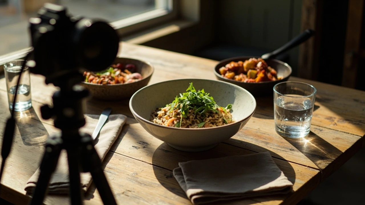
Two bowls of the same soup arrived at the same table, photographed ten minutes apart, and only one of them made a customer order it. The difference was not the recipe, the garnish, or the bowl. It was the food photography. A side-by-side image, a slow scroll on a phone, and a small detail in how the light fell across the surface of the broth pushed one bowl over the line. This guide is for restaurant owners, food brand founders, and marketers who want that line to move in their favor more often, without rebuilding the kitchen or hiring a full-time studio team.
Food photography that earns its place on the menu
Food photography is the deliberate use of camera, light, styling, and editing to make a dish look the way it actually tastes. The job is not to flatter the food. The job is to translate flavor, texture, and portion into a flat image, and to do it consistently enough that a guest feels the dish before they read the description. For restaurants and food brands, the image often is the menu. It is the first thing a delivery customer sees, the thumbnail that decides whether a recipe page gets read, and the post that a hungry person decides to stop scrolling for.
Most owners do not need a magazine-grade studio. They need a repeatable system: a small kit, one or two light setups, a clear styling checklist, and an editing pass that does not lie about the food. The rest of this article walks through the gear, the light, the styling, the shooting process, and the editing choices that turn everyday food into images that pull orders. You can also see how stronger imagery feeds into the wider work of turning one signature dish into a month of content and how it pairs with specificity-driven restaurant marketing.
What food photography is really solving for
A good image of a dish does three quiet jobs at once. It sets expectations, it earns trust, and it reduces hesitation. A diner on a delivery app is comparing ten thumbnails in two seconds. A shopper on a grocery site is comparing one product against four neighbors. A regular on Instagram is choosing whether to spend five more seconds on your post. In every case, the image has to do more than be pretty. It has to answer three unspoken questions: what is in the dish, how much of it will I get, and does it look like the menu description was honest.
That is why food photography sits between product photography and editorial photography. You need the accuracy of a product shot, where colors and proportions match what arrives at the table, and the warmth of editorial work, where the food looks alive. If the image is too sterile, the dish feels mass-produced. If it is too styled, the guest feels bait-and-switched when their plate arrives. The middle ground is where restaurants build reputations.
Phone, mirrorless, or DSLR: pick the body that fits the workflow
For most restaurants and small food brands in 2026, the camera decision comes down to two paths. Either you shoot on a modern flagship phone with a small amount of accessories, or you shoot on a single mirrorless body with a fast prime lens. Full-frame DSLRs are still capable, but most new systems have moved to mirrorless for live-view focusing, better video, and lighter bodies. The right answer depends on how often you shoot, who is behind the camera, and where the images end up.
| Setup | Best for | Strengths | Trade-offs |
|---|---|---|---|
| Modern flagship phone (iPhone 15/16 Pro class, Pixel 8/9 Pro class, Galaxy S24/S25 Ultra class) | Daily social posts, menu refreshes, delivery app thumbnails, quick team shots | Always in your pocket, instant tethering, computational stacking, easy color pipelines, low learning curve for staff | Small sensor, limited depth control without add-on lenses, weaker low light, less resolution for big prints |
| Mirrorless with a 35mm or 50mm prime (APS-C or full frame) | Hero shots for website, packaging, large format print, recipe books, paid ads | Real depth of field, strong low-light performance, raw files with headroom, manual exposure control | Higher upfront cost, heavier bag, longer learning curve, more time per shot |
| Full-frame DSLR (used market, e.g. 5D Mark IV, D850) | Teams that already own a glass kit, magazine-style shoots on a budget | Excellent dynamic range, robust bodies, deep used-lens ecosystem | Heavier, slower live-view autofocus, mirror slap in handheld low light, video features trail mirrorless |
| Medium format or higher-end system (GFX, Phase One) | Packaging campaigns, full-bleed print, agency work for established brands | High resolution, beautiful color rendition, shallow depth at any print size | High cost, slow workflow, overkill for restaurant menu work |
A practical rule of thumb. If the image lives mostly on a 6-inch phone screen, a good phone is enough for 80 percent of restaurant work. If the image will be cropped, printed, blown up across a banner, or sold as stock, mirrorless with a prime lens is the safer investment. Do not buy gear before you know who will actually use it and where the files end up.
The one lens question: 35mm, 50mm, or 85mm
The lens choice does more for the look of food photography than the body. Three focal lengths cover almost every restaurant and food brand use case. The 50mm gives a familiar, near-natural feel that suits plated dishes and bowls. The 35mm lets you get closer to tall or layered dishes and works well for tabletops with several props. The 85mm and longer give strong subject separation and flatter textures, which is useful for products and single hero items but can feel distant on small plates.
- Pick a 50mm f/1.8 or f/1.4 if you want one lens to do most of the work, from menu shots to team portraits.
- Pick a 35mm f/1.8 or f/2 if you shoot in tight kitchens, on small pass counters, or want a wider table story.
- Pick an 85mm f/1.8 if you mostly shoot single items for packaging, ads, or hero website banners.
- Avoid zooms for most restaurant work. A fast prime forces a habit of moving the camera, which usually improves composition.
Light: the single biggest variable in food photography
Light decides whether a dish looks like the kitchen made it or whether it looks like a prop on a shelf. Most restaurant food photography uses one of three setups, and the right one depends on your room, your hours, and your tolerance for setup time. The cheapest, fastest, and most forgiving source is a north-facing window, supplemented with a simple bounce card. The most controlled and consistent setup is a pair of constant LED panels in softboxes. The fastest at volume is a speedlight or small strobe bounced off a ceiling or wall. To place this section in context, the Food overview offers a concise background reference.
| Light setup | Cost range (USD) | Setup time per shot | Look it produces | Best for |
|---|---|---|---|---|
| Window light only (north or east facing) | 0 to 200 (bounce cards, black foam) | 2 to 5 minutes | Soft, natural, slightly cool, gentle shadow falloff | Editorial shoots, social posts, small menus, recipe blogs |
| One LED panel in a softbox or through diffusion | 200 to 600 | 5 to 10 minutes | Clean, controlled, easy to repeat, neutral color | Menu refreshes that need consistency across many dishes |
| Two LED panels (key plus fill or rim) | 500 to 1,200 | 10 to 20 minutes | Studio look, balanced shadows, easy separation from background | Packaging, e-commerce, hero website banners |
| Speedlight or small strobe, bounced or with a softbox | 300 to 900 | 5 to 10 minutes | Bright, punchy, fast recycle, freezes steam and pours | Action shots, drink pours, steam capture, dark wood interiors |
| Continuous ring or panel for video and photo | 80 to 250 | 1 to 2 minutes | Flat, even, less dramatic | Quick overhead shots, kitchen-of-the-day content, training |
Whatever setup you choose, two habits matter more than the gear. First, decide your main light direction before the dish is plated. Side light from a 30 to 45 degree angle usually flatters food because it reveals texture. Second, decide what to do with the shadow side. A white bounce card fills it gently, a black flag deepens it for mood. Flip the choice for half the menu to see which version feels like the dish.
Styling: how to make a real plate look like the real dish
Styling is where food photography quietly wins or quietly disappoints. The aim is not to fake the dish. The aim is to remove the small things that make a real kitchen shot look tired, and to add the small things that make the dish feel intentional. Most of the work is subtraction, not addition. Wipe the rim. Tuck the garnish. Push the brightest element slightly forward. Replace wilted herbs with a few fresh leaves from the same bunch. Use a clean brush to remove stray sauce dots that read as mistakes in close-up.
- Match the plating to the menu description. If the menu says “charred lemon,” the lemon should look charred, not just grilled.
- Use food-safe tweezers for small adjustments, especially with herbs and microgreens.
- Brush oils and glazes with a small paintbrush to revive shine that cooking drained away.
- Use a small spray bottle of water or a glycerin mix on greens and drinks to add a fresh look without soaking the plate.
- Keep one styling kit per cuisine type. Sauces, garnishes, oils, brushes, and tweezers in a single tray saves minutes per shot.
Backgrounds, surfaces, and props: building a small kit that lasts
A solid background kit is cheaper than most owners expect and reusable for years. Two or three surfaces cover almost every dish. A worn wooden board reads warm and casual. A matte concrete or stone slab reads modern and clean. A linen or cotton cloth reads soft and editorial. Avoid glossy surfaces and busy patterns. They fight the food for attention. Props should be in the same family as the dish. A bowl of ramen looks honest with a simple wooden spoon and a small dish of chili oil. It looks confused next to a marble butter knife and a cheese board.
For a small restaurant or food brand, a starter kit of about eight to twelve props is enough. One of each main surface, one of each neutral linen, a small set of plain ceramic and wood bowls, a single sharp knife, a small dish for sauces, and a few garnish props. The point is to have a kit that does not need a decision every time you shoot, so the food becomes the variable, not the props.
Composition: angles, framing, and where to put the eye
Three angles handle most food photography work. A 90 degree overhead shot, also called flat lay, works for bowls, boards, and grouped dishes where geometry matters. A 45 degree three-quarter angle is the workhorse for plated restaurant dishes, because it shows portion height, sauce flow, and garnish. A 10 to 20 degree low angle is reserved for hero shots, drinks, and dishes with vertical drama, like a tall sandwich or a slice of layer cake.
| Angle | Best for | Watch out for |
|---|---|---|
| Overhead (90 degrees) | Bowls, boards, breakfast plates, ingredient layouts, recipe steps | Hot steam looks flat, plates with height lose their appeal, lighting is harder to balance |
| Three-quarter (around 45 degrees) | Most plated restaurant dishes, pasta, sandwiches, salads, burgers | Background can look busy, hands and arms creep in, depth of field needs care |
| Low (10 to 20 degrees) | Hero shots, tall items, drinks, layered desserts, sizzle plates | Foreshortening can distort portions, focus stacking may be required |
For framing, the rule of thirds is a useful starting point, not a law. Place the brightest or most textured element on a third line. Leave more empty space on the side the dish is pointing toward. Avoid centering every plate. Reserve centered framing for symmetrical bowls and overhead recipe shots where the geometry is the point. For an independent reference, the six million avocados our insatiable appetite provides additional context for this point.
Color, white balance, and the truth of the plate
Color is the part of food photography that guests notice without naming. If the burger looks gray, they assume the meat is gray. If the soup looks orange when it is yellow, they assume a different recipe. White balance has to be set deliberately, not left to auto, and it has to be consistent across a menu. A single custom white balance reading off a gray card at the start of a shoot saves hours in editing.
- Shoot a gray card or a white tile as the first frame of every session to lock color temperature.
- Avoid mixing light sources. If you use a window as key, do not add a warm overhead bulb as fill.
- Use a small color checker for paid work and packaging, so retouchers can match the brand palette later.
- Keep a reference of the actual dish on your phone. A quick behind-the-scenes video helps the editor know what the food should look like.
Editing: a short, repeatable pass that respects the food
Editing food photography is not about making the dish look different. It is about removing the small lies the camera told. White balance gets a final nudge. Shadows lift a little, but not enough to wash out the texture. Whites go to a clean point without clipping. Saturation gets a small bump on warm tones, and a smaller bump on greens. Saturation on reds is the easiest place to ruin a dish, especially with tomatoes, chili oil, and cured meats. Sharpening is added for screens at a small radius, and the image is exported at a size and quality that fits the channel.
| Channel | Export size and color space | Notes |
|---|---|---|
| Website hero and menu | 2000 to 2400 px on the long edge, sRGB, around 80 percent JPEG quality or WebP equivalent | Keep file size under about 250 KB to protect page speed |
| Instagram and Facebook | 1080 x 1350 px portrait or 1080 x 1080 px square, sRGB | Match the platform’s safe area and avoid heavy sharpening that looks crunchy on small screens |
| Delivery apps | 1200 x 800 px or 1200 x 1200 px, sRGB, file size often capped around 5 MB | Avoid text in the image, since many apps overlay their own labels |
| Print menu or signage | 300 dpi at final print size, AdobeRGB or a print-specific profile | Soft proof before sending to press to catch color shifts |
Working with a food photographer without losing the menu
Hiring a freelance food photographer is worth it for menu refreshes, brand launches, and any campaign where the food has to carry the budget. A few habits make the day go better for both sides. Send the photographer the full menu in advance, including the dishes that will not be shot, so the styling and prop choices are consistent. Share a short reference board with three to five images you like, and three to five you do not. Bring a team member who knows the plating, because the photographer’s job is the image, and the kitchen’s job is the food. A simple shot list, ordered by complexity, prevents the day from drifting.
- Plan the shot list from simple to complex, so cold dishes are not waiting for the kitchen.
- Hold ten minutes per dish for setup and ten minutes for shooting and tweaks.
- Have backups of every garnish and sauce, since small mistakes happen on set.
- Review a few images on a real phone screen, not just on the camera, before the photographer leaves.
- Capture a reference video of the actual dish behind the scenes, so the editor has ground truth.
Common mistakes that quietly cost restaurants orders
Most food photography problems on restaurant sites and delivery listings are not dramatic. They are small, repeated mistakes that slowly erode trust. The most common is shooting a dish before it has rested. Sauces look like puddles, steam has not formed, and the food looks like it was rushed. The second is using the wrong plate size. A small plate on a large dish makes the portion look stingy. A large plate on a small portion makes the dish look wasteful. The third is shooting in a kitchen with mixed light, which leaves color casts that no one notices individually but everyone senses as “off.” The fourth is over-editing, especially on greens and reds, which is the most common reason a customer feels the food did not match the photo.
How to keep food photography consistent across a team
Consistency is the difference between a brand and a stream of random images. A small style guide, kept to one page, is enough. List the camera or phone model, the lens, the white balance target, the typical shutter and aperture, the main light direction, the standard export size, and a small mood board of approved looks. Pin the guide in the team’s chat and add it to onboarding. The point is not to make every image identical. The point is to make every image look like it came from the same kitchen, on the same day, with the same point of view.
For a deeper look at how a small set of repeatable choices shapes the wider brand, see the practical work in turning one signature dish into a month of content and in specificity-driven restaurant marketing. Those ideas pair naturally with a tight food photography system, because a strong image is the raw material for almost every other channel.
A simple weekly shooting plan for a busy restaurant
Most kitchens cannot dedicate a full day to food photography. A short, repeating schedule works better. Once a week, before service, shoot two to three dishes in about 45 minutes. Use the same setup, the same surface, and the same light. The goal is to build a library of 20 to 30 usable images per month without ever closing the kitchen. Pair the day with a quick menu or delivery audit, so the images you shoot are the ones that actually need updating. The audit does not have to be long. The 15-minute food business website audit covers the essentials and pairs well with a weekly shoot.
- Block 45 minutes before service on a fixed weekday.
- Pick two or three dishes that the team knows need new images.
- Use the same surface, light, and lens every week.
- Edit and export on the same day, so the file does not sit on a memory card.
- Tag each file with the dish name, date, and channel, so it is easy to find later.
Putting it together: a one-page food photography checklist
Use this checklist before each shoot, whether you are running a phone session or a full mirrorless setup. It will not produce a perfect image on its own, but it will remove the most common reasons a shoot disappoints.
- Lens and camera cleaned, battery full, card empty.
- White balance set with a gray card or a known neutral surface.
- Light direction decided. Side from 30 to 45 degrees is the default.
- Background and props pulled from the kit, matched to the dish.
- Plate rim wiped, garnish trimmed, sauce brushed, herbs refreshed.
- Shutter and aperture chosen. A safe starting point is 1/125 s, f/4, ISO 200 on mirrorless. On a phone, lock exposure on the dish and tap to focus.
- One frame of each dish shot from the planned angle, plus a safety frame from a second angle.
- Behind-the-scenes reference photo of the real dish on the pass, to anchor the editor.
- Files backed up to two locations before the camera leaves the kitchen.
- Edit pass, export for the channel, and a quick check on a real phone screen before upload.
Frequently asked questions
What is the difference between food photography and food styling?
Food photography is the full process of capturing a dish on a camera or phone, including light, composition, color, and editing. Food styling is the part of that process where the dish is prepared and arranged on the plate. Styling is a step inside photography, but it is often handled by a separate person on commercial shoots because it requires patience, a steady hand, and a good eye for small details.
Can a modern phone handle real restaurant food photography?
For most restaurant websites, delivery apps, and social posts, a current flagship phone is enough. Phones from the iPhone 15 Pro generation, the Pixel 8 Pro and 9 Pro, and the Galaxy S24 and S25 Ultra lines produce sharp images with good color, and they pair easily with editing apps. For large prints, packaging, and any work that needs strong background blur, a mirrorless camera with a fast prime lens is the better choice.
What lens should I buy first for food photography?
A 50mm f/1.8 prime on a mirrorless body is the most flexible starting lens. It handles most plated dishes, fits in tight kitchens, and produces a natural look that does not distort the food. If you mostly shoot wide table scenes and recipe overheads, a 35mm f/1.8 is a better fit. If you shoot single hero items for ads and packaging, an 85mm f/1.8 will give stronger subject separation.
How do I make food look fresh on the plate when it has been sitting under lights?
Use a small spray bottle of water on greens and cold drinks, brush oils onto proteins with a small food-safe brush, and keep a few spare garnishes ready to replace wilted ones. Steam is harder to fake. Work fast, shoot often, and have a kettle or pot of hot water nearby if the dish needs visible vapor. For hot dishes, a brief moment under a warm lamp can help steam rise before the shutter.
Is natural window light really enough for menu shoots?
For many restaurants, yes. A north or east facing window, paired with a simple white bounce card and a small black flag, produces soft, honest light that flatters most food. The limits show up in busy kitchens, in dark interiors, and in shoots that need to match the look of dishes shot on different days. A constant LED panel solves those limits without much added complexity.
What file size should I export for my website and delivery apps?
For website hero images, export at around 2000 to 2400 pixels on the long edge in sRGB color, at a file size under about 250 KB. For delivery apps, follow the platform’s exact spec, usually 1200 by 800 or 1200 by 1200 pixels, sRGB, and under a few megabytes. Larger print needs 300 dpi at the final size, in a print-appropriate color space.
How often should a restaurant refresh its food photography?
For daily delivery listings, every four to eight weeks. For the main website menu, every two seasons, or whenever a dish changes meaningfully. For brand and campaign work, every quarter is a useful baseline. The exact rhythm depends on how often the menu shifts, how fast ingredients change with the seasons, and how the existing images are performing against newer competitors.
Do I need to shoot in RAW, or is JPEG fine for food photography?
JPEG is fine for social posts and quick delivery listings, and modern phone JPEGs are excellent. RAW is worth the extra step for any image that will be cropped, printed, or used in a paid campaign. RAW files give more headroom in white balance, exposure, and color, which is what saves a shot when the kitchen is moving fast and the lighting is not perfect.
What background is safest for restaurant food photography?
Matte wood, stone, or concrete, and a neutral linen. Avoid glossy surfaces, busy patterns, and anything with text or branding in the frame. The background should support the dish, not compete with it. If a brand needs color, bring it in through a single small prop, not the whole surface.
How does food photography affect online delivery orders?
The thumbnail is the main reason a customer taps one listing over another. Strong food photography increases taps, and accurate food photography reduces the gap between the photo and the actual delivery. Both matter. A click-bait image that does not match the food costs reviews. A flat, dull image that is accurate still loses the click in the first place. Aim for images that are both attractive and honest, so the order converts and the rating stays high.