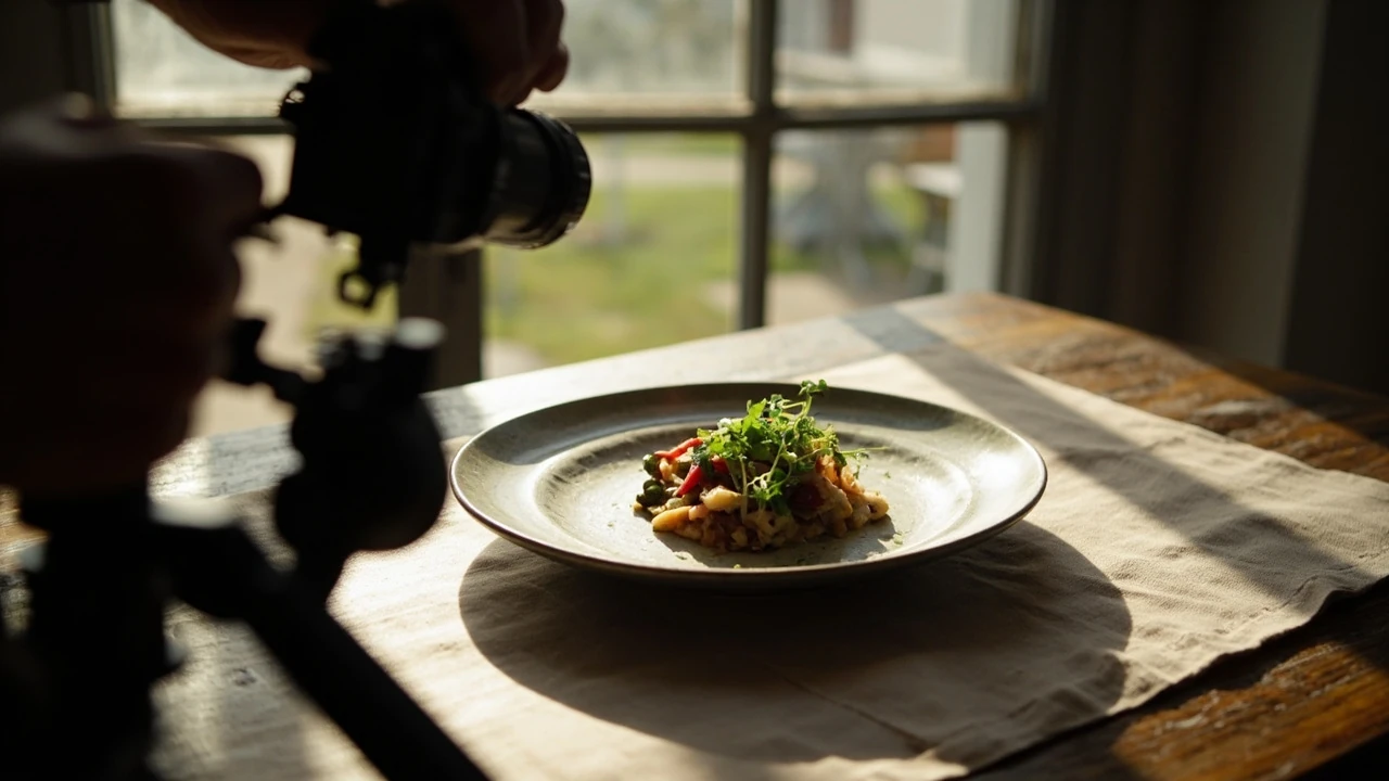
How to photograph menu dishes with natural light
A window, a plate, and a phone are often enough to produce a menu photo that actually sells the dish. The problem is that most restaurant teams point their camera at the food, hope the room is bright, and end up with a flat, yellow, or oddly orange picture that does not match what the guest receives at the table. The reason is rarely the camera. It is the relationship between the light source, the dish, and the surface underneath it.
This guide walks through how to photograph menu dishes with natural light in a way that a small restaurant or food business can actually repeat. The aim is consistent, on-brand menu imagery built from sunlight, a window, a piece of white card, and a clear set of decisions about angle, styling, and editing. Every step below is something you can test during a quiet lunch service and refine before your next menu reprint, website refresh, or delivery platform upload.
Why natural light works so well for menu photos
Natural daylight has three qualities that artificial restaurant lighting usually lacks: it is broad, it is directional, and it is roughly the same color as the room where guests will eat. A soft beam coming through a window wraps around the food, reveals texture, and gives shadow lines that read as depth. In food photography, depth is what tells the eye the dish is real, three-dimensional, and worth ordering.
The reason artificial light struggles is that most dining rooms mix warm tungsten, cool LED, and fluorescent sources. A photo taken under that mix often looks muddy because the camera has to choose a white balance, and whichever choice it makes will leave some part of the dish the wrong color. Daylight from a single window gives the sensor one clean source to read, so the food stays honest.
There is also a psychological point. Guests associate daylight with freshness and the time of day they are most likely to order. When the menu image looks like the dish sitting on a counter at 11 a.m., it matches the moment of decision better than a heavily lit studio shot. For a menu, that honest match often converts better than a stylized studio look.
Window setup: direction, distance, and time of day
The window is your main light. The dish, plate, and table are your subject. The camera is just a recorder. If the first two are wrong, no camera will rescue the picture.
Pick a side-lit window whenever you can
Side light, where the window is to the left or right of the dish rather than behind or in front, is the most forgiving angle for menu work. It sculpts the food, drops a soft shadow on the plate, and keeps the background from blowing out. Front light, with the window behind you, flattens the dish and removes texture. Backlight can be beautiful for translucent drinks or garnishes, but it is harder to control and is not the right default for most plates.
If your only available window is behind the dish, place a large white card or foam board on the side facing the window. The card bounces light back into the shadow side of the food and stops the plate from looking like a dark silhouette. This simple bounce is the single most useful piece of kit for natural light menu photography.
Mind the time of day and the season
The sun moves. A window that is soft and flattering at 10 a.m. can pour hard, contrasty light onto the same table at 2 p.m. as the sun clears a neighboring building. Before you commit to a table for a shoot, watch the light for a full hour at the same time of day you plan to work. Note when the harshest patch hits the surface and adjust the seating distance.
Overcast days are a gift for food photography. The clouds act as a giant diffuser, turning the whole sky into a softbox. On bright, direct sun days, hang a thin white sheet or a roll of tracing paper across the window. That single layer cuts the contrast enough to make almost any dish photographable without buying a softbox.
Distance from the window controls the look
Moving the table closer to the window raises the light level but also raises the contrast between the lit and shadow sides. Moving the table one to two meters back from the glass softens the falloff and gives a more even, gentle wrap. As a starting point, place the dish roughly one to one-and-a-half meters from the glass. Pull back further if the shadows on the plate look too dark.
The kit you actually need
You can build a complete natural light menu setup for less than the cost of a single reprint, and most of the items are already in the building. The table below lists what each piece does and what a sensible substitute looks like, so you can match the kit to your budget instead of buying a preset bundle.
| Item | What it does | Realistic substitute |
|---|---|---|
| Window with a clean view | Acts as the main light source | Any north- or east-facing window with a diffuser sheet |
| White foam board or card | Bounces light into the shadow side of the dish | A blank canvas, a white pizza box, or a sheet of A3 card |
| Black foam board or cloth | Adds depth by deepening shadows | A dark napkin, a piece of black cardboard |
| Stable table or surface | Holds the dish at the right height for the camera | A bar counter, a sturdy stool, or a small folding table |
| Tripod or phone mount | Keeps the camera steady and the angle repeatable | A stack of books, a beanbag, or a small tabletop tripod |
| Plain backdrop | Keeps the eye on the food and the plate | Butcher paper, a linen napkin, or a matte painted board |
| Editing app or program | Fixes white balance, exposure, and small cleanup | Any free RAW editor or a phone app with curves control |
Notice that none of the items above are specialized photography gear. The foam boards are usually the only thing teams need to buy, and they last for years. The point is not to collect equipment. The point is to control the light that already exists in the room.
Styling the dish for the camera
Styling is what turns a plated meal into a menu image. It is also where most restaurant shoots quietly fall apart, because the food was assembled in a hurry and never rechecked under the actual shooting light. Slow this step down. It decides whether the picture works before a single frame is taken.
Wipe, trim, and space the plate
Before the camera comes out, wipe the rim of every plate with a damp cloth. A single sauce smear on the rim reads as careless in a photo even when the dish is technically fine. Trim the edges of garnishes so they look intentional, not ragged. Space the components so nothing crowds the edge of the plate, because the camera will frame tighter than the guest sees at the table.
Steam and freshness are hard to fake later. Shoot dishes that depend on melt, gloss, or foam in the first ninety seconds after plating. If a dish needs a pour-over, plan the pour so the camera catches the stream and the splash but not a splash that has already soaked the napkin.
Pick a background that disappears
Busy tablecloths, patterned napkins, and other plates in frame all fight the main dish for attention. A neutral surface lets the food lead. A few practical choices that work in most restaurants:
- A long piece of unbleached butcher paper pulled across the table for a casual, market-style look.
- A single linen napkin in oatmeal, charcoal, or soft white to add texture without color noise.
- A matte painted board in the same color as your restaurant’s brand accent for a controlled, on-brand feel.
- A bare wooden table if the surface is clean, dry, and not so reflective that it competes with the plate.
Whatever you choose, place it far enough behind the plate that it reads as a soft wash of color rather than a competing pattern. A shallow depth of field will help with this, but it should not have to do all the work.
Camera settings and phone defaults
You do not need to learn manual mode to get consistent menu shots, but a small amount of control pays off. The aim is to keep the food sharp, the background gently soft, and the white balance honest. The settings below work for both a mirrorless camera and a modern phone, with minor wording differences.
| Setting | Recommended value | Why it matters for menu work |
|---|---|---|
| ISO | As low as the light allows, usually 100 to 400 | Keeps the food texture clean and noise-free |
| Aperture | f/4 to f/5.6 for dishes, f/2.8 for taller items | Sharpens the food while softening the table and background |
| Shutter speed | 1/125 s or faster on a tripod, 1/250 s handheld | Prevents motion blur from hands, steam, or a shaky surface |
| White balance | Custom Kelvin 5000 to 5500K, or Daylight preset | Stops the food from drifting yellow or blue under mixed room light |
| Focus | Single point on the tallest or sharpest element | Forces the camera to pick the hero of the dish, not the edge of the plate |
| File format | RAW if possible, highest-quality JPEG if not | Gives you room to fix exposure and white balance in editing |
On a phone, lock focus and exposure on the dish by long-pressing the screen, then drag the exposure slider down a small amount. That single step stops the camera from brightening the background and washing out the food. If your phone has a Pro or Manual mode, dial in the same settings as above. The numbers are the same; only the labels change.
Choosing the right angle for each dish
There is no single right angle. The best angle is the one that shows the most important element of the dish. A flat pasta wants a near-overhead view. A tall burger or a stacked dessert wants a low, roughly 25-degree angle. A drink with a visible top layer wants a 45-degree angle that shows both the top and the side.
A simple way to set the height is to sit at the table where the guest would sit, and shoot from the guest’s eye level. That image will look the way the dish is actually experienced. If you want a more graphic, brand-led image, raise the camera directly above the dish on a small boom or a clamp. Many restaurants keep a short list of three to five signature dishes and shoot each one in two angles only, which keeps the menu visually consistent.
Building a repeatable menu photo workflow
The reason most restaurant photo days end with mixed results is that the team treats each dish as a new problem. The fix is a short, fixed routine that anyone on the team can run during service. The sequence below takes about ten minutes per dish once the room is set.
- Choose the window, the table distance, and the backdrop the day before. Photograph the empty setup with a gray card so the white balance choice is locked in.
- Pre-stage plates, props, and garnishes in trays so the kitchen can plate and pass without delay.
- Wipe the rim of each plate, position the main element first, then add the garnish and any sauce detail.
- Take three to five frames per dish, change one variable each time: angle, garnish placement, or background distance. Pick the best, do not try to perfect in the moment.
- Import into the editing app, apply a saved preset, and export two sizes: one for the menu PDF and one for delivery listings.
- File the originals in a named folder by season, with a copy of the edit, so the next menu reprint is fast.
Run that loop the same way each time and the look of your menu becomes recognizable, which is the underlying goal of consistent photography. Consistency beats perfection in food imagery, because guests scan menus in seconds and recognize a brand before they read a word.
Editing menu photos without overcooking them
Editing should make the photo match what the guest will actually see on the plate, not what the food looked like under a stylizing filter. Three controls do most of the work. Use them in this order and stop touching the image.
- White balance: adjust until the plate, napkin, and neutral surfaces look neutral. Aiming for a clean white napkin is faster than aiming for a number.
- Exposure and contrast: lift shadows gently and lower highlights to recover texture. Hard contrast is the most common giveaway of an over-edited menu photo.
- Saturation and white balance tint: nudge the saturation down slightly, then add a small amount of warmth if the food looks pale. Avoid adding the trendy teal-orange split that does not match a real dining room.
Save the final edits as a preset and apply the same preset to every dish in the same shoot. That single habit is what makes a menu look like one photographer, not one photographer per dish.
Common mistakes when shooting menu dishes in natural light
Most problems with menu photos trace back to a small set of recurring errors. The list below is worth keeping next to the camera during a shoot so the team can self-check before the plate is sent back to the kitchen.
- Mixed light sources, such as a window on one side and overhead halogen on the other, leaving the dish half yellow and half blue.
- Hard sun on the plate because the diffuser was forgotten on a bright day, leading to a blown-out highlight on glossy sauces.
- No fill card, so the shadow side of the dish looks muddy and the plate edge disappears into the background.
- Plate too close to a patterned background, which makes the eye hunt between the food and the table.
- Camera too high or too low for the dish, hiding the hero ingredient under a garnish or a pour.
- White balance left on Auto, so the same shoot ends up with three different color casts across the menu.
- Editing presets swapped per dish, producing a menu that looks like a portfolio rather than one restaurant.
If you can tick off the room setup and the editing preset before the first dish comes out of the kitchen, the rest of the day is mostly plating and clicking. That is the right balance. Photography is a craft, but inside a working restaurant, it is also a repeatable operation.
How natural light menu photos fit into the rest of the brand
Menu photos do not live on the menu alone. The same image is uploaded to delivery apps, used in social posts, embedded in email campaigns, and shown on in-house screens. A natural light approach makes that reuse easier because the colors match the dining room, the kitchen, and the guest’s own phone camera. A studio-lit, heavily retouched image often clashes with the real experience and quietly lowers trust.
If you already publish food stories or strategy pieces on your site, the photos should feel like they came from the same hands. That is also why menu photography is a content and storytelling decision, not just a marketing line item. The pictures are the first thing many guests see of the food, and they set the tone before any words do. For a deeper look at how the rest of the menu copy supports those images, the guide on menu descriptions that actually sell is a useful companion, and the broader piece on food photography that actually sells the dish covers more of the decisions that sit above the camera.
Frequently asked questions
What time of day is best for natural light menu photography?
Mid-morning, roughly two to three hours after sunrise, is usually the most forgiving window for most locations. The light is bright but still angled through the window, so the shadows are soft and the contrast is manageable. Late afternoon, roughly two hours before sunset, can also work well, especially for warm, moody menu styles. Avoid the hour around solar noon, when the sun is high and the window light is harsh and top-down.
Do I need a professional camera to photograph menu dishes with natural light?
No. A modern phone is enough for most menu listings, delivery platforms, and social posts, provided you control the light, lock the focus, and edit with a saved preset. A dedicated camera gives you more control over depth of field and RAW files, which is useful for printed menus and large signage, but it is not a requirement for the method described here.
How do I deal with mixed lighting if I cannot turn off the room lights?
Turn off or unplug as many overhead sources as you can, including the kitchen pass-through lights that often spill into the dining room. Cover any remaining practical lamps with a small diffuser or simply unscrew them for the shoot. Once the room is reduced to a single daylight source, set a custom white balance in camera and confirm it against a white napkin in the first frame.
What is the best background for menu photos with natural light?
A neutral, non-reflective surface that matches the restaurant’s brand tone is usually the safest. Unbleached butcher paper for casual concepts, oatmeal or charcoal linen for full-service rooms, and a matte board in a brand accent color for tighter, more graphic menus. Avoid patterns and anything glossy, because both pull attention away from the food.
How do I keep the food looking fresh during a long shoot?
Shoot in the order the kitchen can re-plate fastest, not the order the menu is printed in. Keep a small towel and a squeeze bottle of water near the set to refresh leaves and gloss. For dishes that lose shape, such as whipped cream or ice cream, work in short batches and have a backup portion ready in the kitchen.
Should I shoot every menu item in the same style?
Use one consistent style across the menu, but allow the angle to follow the dish. Keeping the lighting, the background, the editing preset, and the plate range consistent is what builds a recognizable look. Changing the camera angle to match each dish is normal and is not a break in style, as long as everything else stays the same.
How many photos do I need for a menu redesign?
Plan for one strong image per menu item, plus one or two hero images for the cover or top of each section. If you are also updating delivery listings, plan for a square crop of each dish in addition to the landscape crop. Shooting both at the same time saves a re-shoot later.
What is the simplest editing preset to start with?
A neutral white balance, a small shadow lift, a small highlight recovery, and a slight reduction in saturation. Save that as your base preset and apply it to every photo in the same session before making any per-dish tweaks. Most menu photos only need a few minutes of editing when the lighting on set was controlled.
Can natural light work for drinks and pour-over shots?
Yes, but the setup shifts toward a backlit or side-backlit window so the liquid catches the light. Use a darker background to keep the rim light readable, and shoot at a faster shutter speed to freeze bubbles and streams. A small piece of black card on the shadow side will deepen the drink and make the bubbles pop without buying a strobe.
How often should a restaurant reshoot its menu photos?
Reshoot whenever the dish itself changes in a way a guest would notice, which is usually once or twice a year for most menus. Also reshoot whenever the room, tableware, or brand color changes, because the old photos will no longer match the dining experience and the trust gap is bigger than most operators expect.