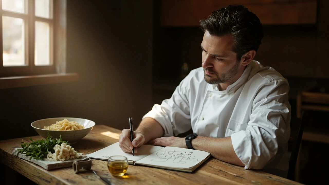
Food drawing for restaurants, cafés, and food brands
A small bistro in Lisbon doubled its lunch covers the week a hand-drawn menu board appeared outside the door. A bakery in Austin sells out of a sandwich three hours earlier when a staff member’s sketch of it circulates online. A natural wine bar in Brooklyn ships merch with a single-ink illustration of its charcuterie plate. None of these businesses hired an agency or commissioned a campaign. They made a food drawing and put it where the right people would see it.
That is the real reason to learn food drawing as a restaurant or food brand operator. A sketch is one of the cheapest, fastest, and most personal pieces of content you can produce, and it sits at the intersection of menu design, food photography, brand storytelling, and social content. This guide is for owners, chefs, marketers, and content leads who want a working method rather than a list of supplies. By the end, you should be able to decide when a food drawing will outperform a photograph, how to make one that actually looks like the dish, and how to use the same sketch across a menu, a website, packaging, and a month of social posts.
What food drawing actually is in a restaurant context
In a working kitchen or studio, food drawing is the deliberate illustration of a dish, ingredient, or food object for a defined purpose. It is not the same as fine art still life, food styling for photography, or graphic design. A food drawing in a restaurant setting is a small, repeatable tool that helps a guest or customer understand what is in front of them, what to expect, or why a particular plate matters.
Three practical forms show up most often:
- Menu and menu board illustration. Hand-drawn icons or accents next to dish names, full illustrated menus for special events, and chalk-style drawings on sandwich boards.
- Brand and packaging art. A signature dish rendered as a logo-like mark, a label for a bottled sauce, or a hero illustration on a takeout bag.
- Editorial and social content. Recipe cards, newsletter headers, blog headers, and feed posts where a sketch is faster, cheaper, or more on-brand than a styled photograph.
The same skills power all three, and a single drawing can be repurposed across all of them. The method below is written so a non-illustrator can produce a useful first piece within a session and build a small library over a few weeks.
Why restaurants are returning to drawn food imagery
Photographs have dominated restaurant marketing for fifteen years, and they are not going away. Drawn food imagery is returning alongside them because it solves specific problems that photography often does not.
Photographs demand controlled lighting, fresh plating, careful styling, and a camera or phone used by someone who knows how to handle it. Drawn food imagery demands a pen and twenty minutes. When a menu changes weekly, when a new special appears on Tuesday and is gone by Sunday, or when a team is small and the marketing budget is a line item under “miscellaneous”, a sketch is often the realistic choice.
There is also a tonal reason. Photographs are expected to look aspirational, glossy, and slightly larger than life. A drawing can be looser, more honest, and more personal, which suits small operators, neighborhood spots, and farm-to-table concepts. Several established photographers and stylists have written about this shift toward food photography that actually sells the dish, and a drawing can carry the same selling job with a different voice.
Finally, a drawing ages well. A photograph of a dish from a menu that no longer exists can feel like a small embarrassment on a website. A sketch of a former special can read as charming and historical. For long-running menus and heritage brands, that durability is a quiet advantage.
Tools you can start with tonight
The shortest path from “I want to try this” to a finished food drawing is to use what you already own and add one or two items at a time. The list below is organized from least to most investment, and every tool here is enough to produce a publishable piece.
- Pencils. A 2B and a 4B mechanical pencil cover about 90% of sketch work. A 2B lays down a soft, even line for construction. A 4B pushes values deeper for shadows and texture.
- Pen. A 0.05 or 0.1 mm waterproof fineliner, such as a Sakura Pigma Micron or a similar archival ink pen, gives a clean final line that will not smudge if you decide to add color later. A brush pen adds expressive weight for calligraphic menus and signage.
- Paper. A sketchbook with paper around 90 to 120 gsm takes light ink without bleeding. Tracing paper is useful for moving elements around a composition without redrawing the whole plate.
- Eraser. A soft kneaded eraser lifts graphite without scratching the paper, which matters when a dish has bright highlights such as a glaze or a soft-boiled egg yolk.
- Color, if you want it. Colored pencil, watercolor pencil, or a small pan of watercolor. None of these are required, and monochrome line work is a perfectly valid style.
- A phone or scanner. Used to capture the drawing at print quality. Natural daylight next to a window produces cleaner results than a desk lamp for a quick phone photo.
Two habits matter more than the tools. Always work from reference, not memory, until you are confident with a dish, and always draw the plate shape before the food on it. A bowl drawn as an oval will look correct from a 30-degree angle; a bowl drawn as a circle will look like a target.
A simple four-step method for a single dish
Most first attempts go wrong at the start, not the end. The method below is built to prevent the two most common failures: a plate that looks like a diagram of its parts, and a sketch that flattens the food into the surface it sits on.
Step 1: Block the composition in pencil
Place the plate, board, or vessel on the table in front of you. Stand or sit so you are looking down at roughly a 30 to 45 degree angle. Lightly sketch the outline of the vessel first, then mark the rough footprint of each component as a simple shape. A piece of fish is an oval. A handful of greens is a soft cloud. A drizzle of sauce is a curved line. Do not draw detail at this stage. The goal is to confirm that the composition fits the page, the plate is centered, and the food actually looks like food when reduced to shapes.
Step 2: Establish the light direction
Decide where the light is coming from and put a small arrow at the edge of the page. Every shadow, highlight, and texture cue will obey that arrow. Inconsistent light is the single biggest reason a food drawing looks “off” even when the line work is careful. A dish lit from the upper left should have shadow on the lower right of every raised element, including the rim of the plate, the curve of a dumpling, and the side of a glass.
Step 3: Draw the food on top of the block-in
Switch to the pen and work from back to front. If a garnish sits in front of a piece of protein, draw the protein first, then the garnish over it. Use varied line weight: heavier lines on the side of an object that turns away from the light, lighter lines on the side that faces it. Vary the rhythm of marks for different textures. A grilled steak wants short, broken lines and a few small flecks. A roasted chicken wants longer, smoother curves. A leafy herb wants quick, branching strokes.
Step 4: Add the cast shadow and a final pass
A drawing without a cast shadow floats on the page. Add a soft, hatched shadow on the surface of the plate or board, on the side opposite the light, and on the table where the vessel meets it. Keep the shadow soft and let the hatching follow the curvature of the plate, because a flat, evenly black shadow will make the food look pasted on. After the ink has dried, gently lift any graphite shine with a kneaded eraser and photograph or scan the finished piece in even light.
Choosing a style that fits the brand
Style is not a personality quiz. It is a set of decisions about line, color, and finish that have to line up with how the restaurant already sounds, looks, and prices. The table below maps four common food drawing styles to the kind of operation that tends to suit them, and to the risks each style carries.
| Style | What it looks like | Best fit for | Risk to watch |
|---|---|---|---|
| Loose single-ink line | One pen weight, visible gesture, no color, generous white space | Neighborhood cafés, natural wine bars, bakeries, supper clubs | Can read as unfinished if the line is too shaky or the page is too empty |
| Detailed crosshatch | Fine pen, dense hatching for shadow, no color or minimal color | Heritage restaurants, butcher shops, cookbook-style brands, editorial newsletters | Time-consuming; consistency across many dishes is hard without a template |
| Watercolor wash with line | Soft color fills, defined dark line, slight bleed allowed | Farm-to-table restaurants, floral cafés, hospitality brands with a soft tone | Color shifts when scanned; paper choice affects final hue |
| Flat color vector | Solid fills, no gradient, clean edges, often digital | Fast-casual, delivery-only concepts, modern bar programs, app-forward brands | Can feel generic if the palette and shape language are not distinctive |
Pick the style that matches the brand’s existing voice, not the one you personally find most appealing. A butcher shop with a heavy, classical wordmark will feel disjointed with loose single-ink sketches of its sandwiches. A bright modern poke counter will feel stiff with crosshatched etchings of its bowls. Consistency between wordmark, plate, interior, and drawing is what makes the final asset feel like part of the restaurant rather than an ornament on top of it.
Where a food drawing earns its keep
A drawing only pays off if it is used. The list below pairs each format with the role the drawing plays and the practical detail that decides whether it works in that slot.
- Printed menu. One small icon next to each dish name helps guests scan a long list, especially for non-native speakers. Keep the line weight identical across icons, or the menu will look uneven.
- Chalkboard or sandwich board. Larger, looser drawings work at distance. Leave more white space, and remember the board will be photographed often, so composition matters.
- Website and online ordering. Use the drawing as a hero for a category page or as a replacement thumbnail on a delivery listing. Drawn thumbnails often out-perform mediocre photographs in click-through on delivery apps because they read clearly at small sizes.
- Social content. A food drawing paired with a short note about the dish is a fast, low-cost post. Batch the drawings on a single afternoon and schedule the posts across a week.
- Email and newsletter headers. A horizontal drawing crops well to a banner. Avoid putting text inside the drawing itself; let the layout add the headline.
- Packaging and merch. A signature dish rendered once at a higher level of finish can become a stamp, a label, or a t-shirt print. Save the master file at 300 dpi or in vector for clean scaling.
- Print collateral. Business cards, postcards, and press kits gain a tactile edge from a drawn element on uncoated paper.
The strongest food operators treat a single drawing as raw material, not a finished asset. One well-drawn plate of pasta can become a menu icon, a website header, an Instagram post, a newsletter banner, and a label on a jar of sauce, all without re-illustrating anything. That is the leverage a photograph rarely offers at the same level of cost.
Working with a staff member who can draw, but is not an illustrator
Most restaurants already have someone on the team who can hold a pen and make a recognizable dish. The job of the owner or marketing lead is to give that person a small, repeatable system, not a brief to “design something nice”. The approach below is what tends to work in a working restaurant, not a design studio.
- Pick five to ten signature dishes and draw them in a single sitting. The first few will be the worst. By the fifth drawing, the team member will have settled on a working method.
- Agree on a small fixed set of decisions: the angle of the plate, the size of the drawing relative to the page, the line weight, and whether color is used. These four decisions do most of the work of making a set of drawings feel like a family.
- Scan or photograph every drawing in the same light, against the same neutral background. Consistent capture is half of consistent presentation.
- Build a simple file structure. One folder per dish, with the master scan, a clean version with the page trimmed, and export sizes for menu, social, and web.
- Use the drawings in rotation for one month before judging the result. A food drawing gains recognition through repetition, not novelty.
If a restaurant wants to take the work further without a full-time illustrator, the next step is usually a short commission with a working illustrator who can absorb the style set out in the first batch and produce another twenty or thirty pieces in the same family. This is also where the work connects to how a restaurant brand earns recognition: the drawings are not decoration, they are part of the identity system.
Common mistakes and how to avoid them
Most first efforts fail in predictable ways. None of these failures require talent to fix. They require attention.
- Drawing the food as a top-down plan. A plate seen from directly above flattens the food. Tilt the viewing angle to about 30 to 45 degrees and the food gains volume for free.
- Letting the food touch the edge of the plate. Leave a small margin of plate visible around the food. Crowding makes the drawing feel cramped and busy.
- Uniform line weight. Every line at the same weight reads as a coloring book. Push weight on shadow sides and keep it light on highlight sides.
- Ignoring the plate. The plate is a large part of the composition. Give it a believable thickness and a believable shadow where it meets the table.
- Overworking the garnish. A sprig of herb, a crack of pepper, and a drizzle are usually enough. Stop before the dish looks busy in the drawing.
- Tracing a photograph pixel by pixel. This produces a flat, dead drawing. Use the photograph as a reference for shape and shadow, then redraw in your own hand.
- Mixing styles within a set. A loose ink drawing next to a tight watercolor on the same menu reads as a mistake. Pick one style and hold it.
Food drawing for menus, marketing, and the website, side by side
It helps to see the same dish imagined in three roles at once. The table below treats a single plate of burrata with tomatoes as a menu icon, a website hero, and a social post, and shows how the drawing changes in each role.
| Use | Crop | Level of finish | Color | Caption role |
|---|---|---|---|---|
| Menu icon | Square, centered on the plate | Line only, light shadow, no background | Optional; monochrome often works best | Carries the dish name beside it |
| Website category hero | Wide rectangle, plate on the right, space on the left for a headline | Full detail, including herbs, oil, and a soft table shadow | Watercolor or flat color depending on brand | Reads as a feature image and supports SEO on category pages |
| Social post | Square or 4:5, plate slightly off-center, generous background | Medium detail, slightly looser than the website version | Matches the season of the post | Carries a short caption about the dish or the producer |
The point of this table is not to prescribe a single look. It is to show that the same drawing can be re-cropped, re-colored, or re-finished for three very different jobs, and that planning the crop at the drawing stage saves hours of work later.
How this fits into a broader content and storytelling system
A food drawing is a unit, not a campaign. A useful content system treats each sketch as one piece in a larger pattern, alongside short written notes, photographs when the dish warrants them, and the occasional behind-the-scenes detail about who grows the produce or writes the recipe. The sketch carries recognition. The text carries context. Together they make a post feel specific, which is exactly the quality that lifts a restaurant’s content above the generic stream.
That link between a small visual asset, a specific dish, and a written story is also why specificity tends to win food marketing. A drawing of a particular heirloom tomato from a particular farm, with a sentence about why the farm grows it, is harder to ignore than a glossy photo of an anonymous red tomato on a white plate. The drawing is simply the cheapest, most repeatable way to put a specific thing in front of a specific reader.
A 30-day plan to build a small library of food drawings
The plan below is designed for a working restaurant with one person willing to spend about an hour per session. It assumes no prior drawing experience, only a willingness to keep the camera or scanner nearby and to publish as you go.
- Week 1, day 1. Pick the single dish that defines the restaurant. Block the composition in pencil, finish in pen, and scan it. Do not post it yet.
- Week 1, day 3. Draw the second most important dish, in the same style and at the same angle. Scan it beside the first.
- Week 1, day 5. Draw a side, a drink, or a dessert to test whether the style holds for shapes that are not round plates.
- Week 2. Post the first three drawings, one at a time, with short notes about the ingredients. Watch which post earns the most saves or shares.
- Week 3. Draw three more dishes, this time including at least one seasonal special that will only be on the menu for two weeks.
- Week 4. Place the strongest drawing on the menu as a small icon, on the website as a category hero, and in the next newsletter header. Measure what you can, and keep what works.
By the end of the month, a restaurant has a small, usable library of food drawings, a tested style, and a sense of which dishes earn attention when drawn. That library compounds. Month two starts ahead of month one, and by month three the team can usually turn a single dish into a finished menu icon in under an hour.
When to skip the drawing and use a photograph instead
A drawing is a tool, not a virtue. There are cases where a photograph is the right answer, and the table below names them honestly.
| Situation | Better choice | Reason |
|---|---|---|
| A dish whose appeal is color, sheen, or steam | Photograph | A glistening jus, a frothy head on a beer, or rising steam carry information that a flat drawing cannot easily convey |
| A dish that changes every service | Photograph, then optional drawing | Daily specials often move faster than a drawing can be produced and approved |
| A press feature or magazine spread | Photograph, in most cases | Editorial outlets usually expect high-resolution photography for first features |
| Heritage menu items, signature dishes, house recipes | Drawing | The dish is stable, the recognition value is high, and the drawing can live across many uses |
| Children’s menus, allergen lists, dietary icons | Drawing | Icons are easier to recognize at a glance and easier to localize than small photographs |
| Packaging and merch for a hero product | Drawing, often as a stamp or vector | A clean drawing scales without quality loss and reproduces predictably on bags, labels, and shirts |
Most restaurants end up using both, and a good rule of thumb is to photograph what moves and draw what stays.
Frequently asked questions
Do I need to be able to draw well to start food drawing for my restaurant?
You need to be able to hold a pen and observe a dish for ten minutes. The first five drawings will not be portfolio pieces, and they do not need to be. The goal of the early work is to settle on a consistent angle, a consistent line weight, and a small library of recognizable dishes. If a staff member can already doodle a recognizable coffee cup, they can produce a usable food drawing with a single afternoon of practice and a clear reference photo to work from.
Should I color the food drawing or keep it black and white?
Both work, and the choice depends on the brand and the use. Monochrome line work is faster, cheaper to print, and ages well. Color adds appetite appeal and a sense of seasonality, but it takes longer and needs a slightly more controlled process to scan cleanly. A reasonable approach is to start in monochrome for menus and icons, and reserve color for hero uses such as website category images and packaging.
What paper and pen should a beginner buy first?
A 0.1 mm waterproof fineliner and a sketchbook with smooth paper around 90 to 120 gsm are enough to start. Add a 2B pencil, a kneaded eraser, and a phone tripod for capture. Total cost is modest, and the same kit covers a year of work for most small restaurants. Upgrade later, if at all, with a brush pen for signage and a small pan of watercolor for hero illustrations.
How do I keep a set of food drawings looking consistent?
Lock in four decisions before you start the second drawing: the angle of the plate, the size of the drawing on the page, the line weight, and whether color is used. Use the same pen, the same paper, and the same light direction across the set. Photograph every drawing in the same place. A simple template of those four decisions does more for a library of food drawings than any amount of practice.
Can a food drawing replace professional food photography?
For some uses, yes, and for others, no. A drawing is a strong replacement for menu icons, brand marks on packaging, social thumbnails, and category heroes on a website. A photograph still carries information that a drawing cannot, especially for dishes where color, sheen, or steam is part of the appeal. Most successful restaurant brands use both, and a sensible rule is to photograph what moves and draw what stays.
How long does a single food drawing take once I am practiced?
For a simple plate, an experienced non-illustrator can block, ink, and scan a usable food drawing in twenty to forty minutes. A more complex dish, or a hero illustration with watercolor, will take an hour or more. Batching is the real time-saver: drawing four dishes in a single afternoon is faster than drawing one per day, because the setup, the light, and the materials stay the same.
How do I use one food drawing across the menu, the website, and social media?
Plan the crop at the drawing stage, not after. A square crop works for a menu icon and a social post. A wide rectangle works for a website category hero and a newsletter header. Save the original scan at the highest quality available, and export smaller versions for each channel. A single drawing can comfortably serve five or six uses without redrawing, as long as the master file is well kept.
Is it worth commissioning a professional illustrator for food drawings?
It depends on volume and consistency. For one or two special pieces, a commission is a good use of budget. For a working library of thirty or forty dishes that need to feel like a family, it is faster and cheaper to start in-house, lock in the style, and then hand the system to an illustrator to scale. This also keeps the drawings recognizably part of the restaurant’s voice rather than a separate artistic project.
Where should a food drawing live on a restaurant website for the best result?
Use a strong drawing as the hero image on a category or menu page, and as a small icon next to dish names where the menu is long. Avoid placing a detailed drawing in the main navigation, where it will be cropped aggressively, and avoid placing it on the home page hero if the page also carries a large headline, because the two will compete. Reserve the most detailed drawing for the page where the dish itself is the subject.
How do I know if a food drawing is working for the business?
Track three signals over a month. First, time on page for pages that use the drawing instead of a photograph. Second, saves and shares on social posts that use the drawing. Third, any direct customer comment, in person or online, that mentions the drawing. A working food drawing will usually show up in at least one of those signals within a season, and the answer is rarely about talent. It is about consistency, placement, and the willingness to keep drawing.