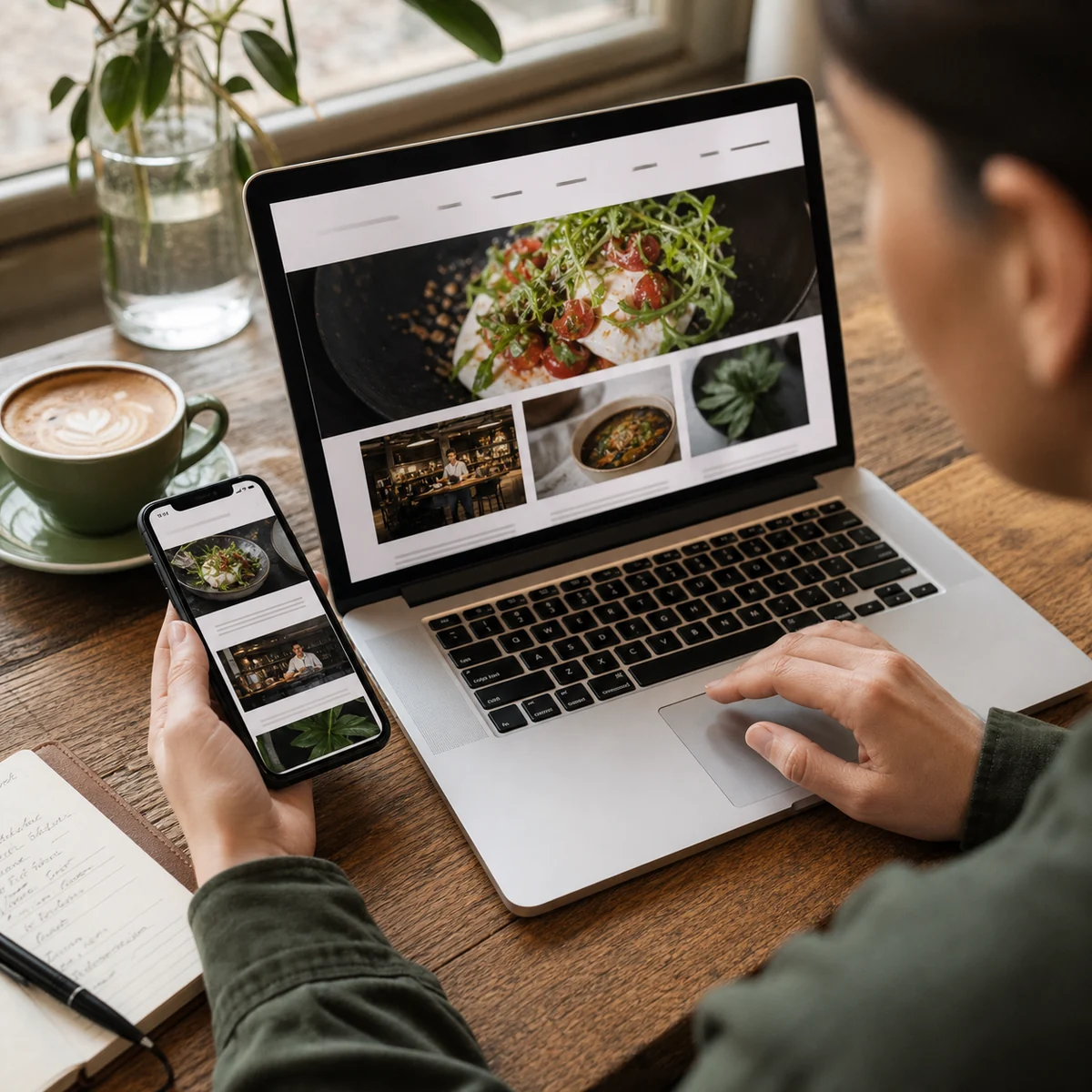
A food business website does not need to be enormous to work hard. It needs to answer the right questions in the order a real customer asks them. A restaurant guest wants to know what the place serves, whether it is open and how to book. A market shopper wants location, hours and what is in season. A buyer evaluating a producer or supplier needs product details, service area, proof and a clear route to an enquiry.
This 15-minute food business website audit is designed to reveal the most expensive points of friction without turning the exercise into a six-week redesign project. Set a timer, use a phone rather than your usual office screen, and record only what you can verify. The purpose is not to produce a perfect score. It is to identify the next fix that will make the site easier to find, understand and use.
Minutes 0–2: inspect the search result
Start outside the website. Search the business name and then a realistic non-brand query such as “bakery near me,” “local milk supplier,” “Italian deli in Bristol” or “wholesale sauces for cafés.” You are not trying to prove a ranking position in two minutes. You are checking whether the result that already exists gives a customer an accurate invitation.
Read the page title and description. A useful title identifies the business, its category and, where relevant, its location. The description should explain the offer in natural language rather than repeat a list of keywords. Check whether the search result points to the most useful page. A query for wholesale products should not land on a consumer story with no trade information.
Then compare the visible details with the primary map listing. Business name, address, phone number and opening hours should agree. For a producer without a public storefront, service area and enquiry details should be explicit so a buyer does not arrive at a factory expecting a shop.
Minutes 2–5: run the five-second homepage test
Open the homepage on a phone and look only at the first screen. Within five seconds, can you say what the business is, who it serves and what to do next? Beautiful photography cannot compensate for an unclear offer. “Made with passion” could describe almost any food company. “Small-batch cultured butter for bakeries across the South West” gives a buyer something concrete to understand.
The first screen should usually contain four signals:
- Identity: restaurant, grocer, food brand, producer, supplier or another recognisable category.
- Specificity: cuisine, product, speciality, service area or the reason the business is different.
- Practical context: location, delivery area, trade focus or availability.
- Primary action: view the menu, find a store, shop products, request a trade list or make an enquiry.
One primary action is normally stronger than five competing buttons. Secondary actions can still exist, but the design should make the most common customer path obvious. If a cookie banner, newsletter pop-up or animation blocks that path, count it as friction.
Minutes 5–8: follow the highest-value journey
Choose one valuable task and complete it from the homepage. For a restaurant, find a dish and attempt to reserve or order. For a market, find today’s hours and directions. For a packaged-food brand, find a product and learn where to buy it. For a supplier, locate specifications and submit a trade enquiry.
Count taps, dead ends and moments of uncertainty. A reservation button that opens the wrong location is worse than no button because it creates false confidence. A product catalogue that hides pack size or minimum order quantity makes a buyer do unnecessary work. A menu available only as a large PDF can be slow, hard to read and difficult for search engines to interpret.
Every important journey should answer three questions: “Is this for me?”, “Can I trust it?” and “What happens next?” If the visitor must call for a basic fact that could safely be published, the site is transferring avoidable work to staff.
Minutes 8–11: audit the menu, product or category content
Food is specific, so food content should be specific too. Review the page that describes the core offer. Are product names and photographs accurate? Can someone understand ingredients, format, size, availability and important dietary information? Are claims supported rather than decorative?
For restaurants and cafés, use readable HTML for the current menu even if a downloadable version is also offered. For markets and grocers, category pages can explain the range, seasonality and sourcing without pretending every item is permanently in stock. Food brands benefit from individual product pages that connect ingredients, use cases, stockists and recipes. Suppliers need pages organised around the way buyers search: product type, application, pack format, geography and delivery capability.
Look for generic filler. Words such as fresh, premium, authentic and delicious become useful only when followed by proof. “Bread baked in our kitchen at 5 a.m.” is visible. “Milk collected from three family farms within 20 miles” is memorable. “Next-day chilled delivery for orders placed before noon” helps a buyer make a decision.
Minutes 11–13: check local trust and business proof
A visitor should not need detective work to confirm that the business is active. Check the footer and contact page for a real address or service area, working email, phone number when appropriate and links to current policies. If there are multiple locations, each location deserves a page with its own hours, directions, services and local details.
Recent, specific photography is a strong trust signal. Show the storefront a customer will recognise, the actual product, the team or process when relevant, and packaging that matches what is sold. Reviews and testimonials are useful when they are attributable and connected to the claim being made. Trade customers may need certifications, storage information, fulfilment expectations or a clear explanation of the onboarding process.
Test the contact route. Submit the form with a clearly labelled internal test, confirm that validation makes sense and verify where the message goes. A polished contact form that nobody receives is not a conversion feature.
Minutes 13–15: test speed, accessibility and resilience
Switch off Wi-Fi and load the key page on a mobile connection if practical. You are looking for obvious failures: a hero video that delays the message, images much larger than their display size, layout movement while the page loads or controls that respond only after several seconds.
Check the basics of accessible use. Can you see keyboard focus? Do buttons describe their action? Does meaningful photography have useful alternative text? Are headings in a logical order? Is text readable against its background? Accessibility is not a final compliance sticker; it is part of making information usable in bright sunlight, on a slow device, with one hand or with assistive technology.
Finally, resize the browser or rotate the phone. Look for clipped menus, overlapping buttons, horizontal scrolling and forms that become impossible to complete. These are high-priority defects because they can stop the customer entirely.
Score the audit without hiding the real problem
Use a simple yes, partly or no for each area. Do not average the results too quickly: one broken booking route can matter more than five minor copy improvements.
| Area | Question | First useful fix |
|---|---|---|
| Search | Does the result accurately describe the offer? | Rewrite the title and description for the real page intent. |
| First screen | Can a new visitor understand the business? | Add a concrete category, place or customer statement. |
| Journey | Can the visitor complete the main task? | Repair the first blocked or misleading step. |
| Content | Is the food offer specific and current? | Replace vague claims with product-level proof. |
| Trust | Can the visitor verify the business? | Correct contact, location, policy and operating details. |
| Experience | Does the page work on a real phone? | Remove the heaviest blocker before adding effects. |
Prioritise fixes by customer impact
Place every issue in one of three groups. First are blockers: wrong hours, broken forms, unreadable menus, missing product information and incorrect location links. Second are confidence problems: generic copy, old photography, unsupported claims and unclear policies. Third are polish: animation timing, decorative spacing and visual refinements that do not prevent action.
Fix blockers first, then repeat the same customer journey. Measure a small set of outcomes such as completed enquiries, reservation clicks, direction requests, product-page visits or stockist clicks. The best food business website audit ends with a visible change in customer behaviour, not a longer design wish list.
How the audit changes by food business type
Restaurants, cafés and bakeries
Prioritise mobile menus, hours, location, booking or ordering, and clear photography of the actual experience. Check each location separately.
Markets, grocers and supermarkets
Prioritise store pages, departments, services, seasonal ranges, accessibility information and directions. Do not create permanent promises for stock that changes daily.
Food brands and producers
Prioritise product pages, ingredients, usage ideas, stockists and the evidence behind sourcing or production claims.
Suppliers, wholesalers and distributors
Prioritise buyer language, product formats, territories, operational proof and a low-friction route to request trade information.
Frequently asked questions
How often should a food business audit its website?
Run the quick audit after changes to hours, menu, product range, locations or ordering systems, and schedule a broader review several times a year. High-change businesses may need a short operational check every month.
Do we need a redesign if the audit finds problems?
Usually not. Correct information, a clearer first screen, better navigation and repaired calls to action often create more value than changing the entire visual system.
What should we fix first for SEO?
Fix crawlable, useful content and customer blockers together. A search visitor landing on an inaccurate or unusable page is not a successful result. Start with the page connected to the most valuable real-world action.
Use the Local Food Visibility Check to continue the audit with a saved, step-by-step scorecard.